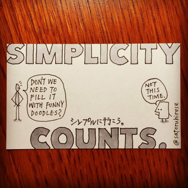
Simplicity counts.
シンプルに行こう。
Don’t expect a logo to do too much. This is one of the basic rules for designing a logo.
But this world doesn’t always work that way. Not a few businesses want to make their logo look like a drawing. They often want to add many texts so that their logo itself can tell what their business is. In the end, their logo becomes very noisy. Even worse, many people tend to avoid such noisiness unconsciously, and their logo doesn’t appeal to their target audience as they expected.
A logo is an identifier. It doesn’t sell anything or promote our business—it just tells what we are. A great logo is very good at doing this, like the logo of Apple, Nike, and McDonald. People don’t even need a single word to identify those logos.
What forces many businesses to add unessential factors to their logo?
FEAR.
We prefer simplicity when we choose something. But when we provide something to the world, simplicity often scares us. “Well, people might say this is insufficient or not good enough… So let’s add one more thing. Or add as many things as we can until we become comfortable.”
Fear increases complexity. Confidence reduces it. Simplicity tells how confident we are about our business and life.