
Introduction
You’re at a conference. The speaker drops a bombshell insight. You scramble to write it down. Twenty minutes later, your notebook looks like a crime scene—words trailing off the page, random doodles in the margins, and absolutely no way to find that brilliant idea when you need it next week.
Here’s the thing: the biggest struggle in sketchnoting isn’t drawing—it’s layout. Mike Rohde, the godfather of sketchnoting who literally wrote The Sketchnote Handbook, has heard this from thousands of people. When he asked his community what held them back, the answer came back loud and clear: not artistic ability, but knowing how to structure information on the page.
That’s where sketchnote layouts come in. Think of them as blueprints for your brain. They’re pre-determined ways to arrange information so that your notes become usable—not just pretty. By the time you finish this article, you’ll have seven powerful structures in your toolkit, know exactly when to use each one, and never run out of space mid-sentence again.
Let’s fix your notes for good.
Background
Sketchnoting—visual note-taking that combines words, drawings, shapes, and structure—has exploded over the past decade. Mike Rohde coined the term in 2006 while taking notes at conferences, frustrated with traditional linear outlines that failed to capture the texture of ideas. His breakthrough? Using a pen instead of a pencil (no erasing, no perfectionism), working in a pocket notebook, and—crucially—not trying to write everything down.
The research backs him up. Studies on visual note-taking show that combining text with images dramatically improves recall and comprehension. When you sketchnote, you’re not just transcribing—you’re processing. You’re forced to distill, prioritize, and make connections in real time.
But here’s what the research also shows: structure matters. A lot. Academic analysis of sketchnotes has identified core components including content, layout, structuring elements, and visual styling as essential to effectiveness. Without a layout plan, even the most beautiful doodles become visual noise.
The good news? You don’t need to be an artist. As Rohde constantly reminds us, sketchnoting is about “ideas, not art”. The building blocks are embarrassingly simple: circles, squares, triangles, lines, and dots. Everything else is just arrangement.
And arrangement? That’s what we’re here to master.
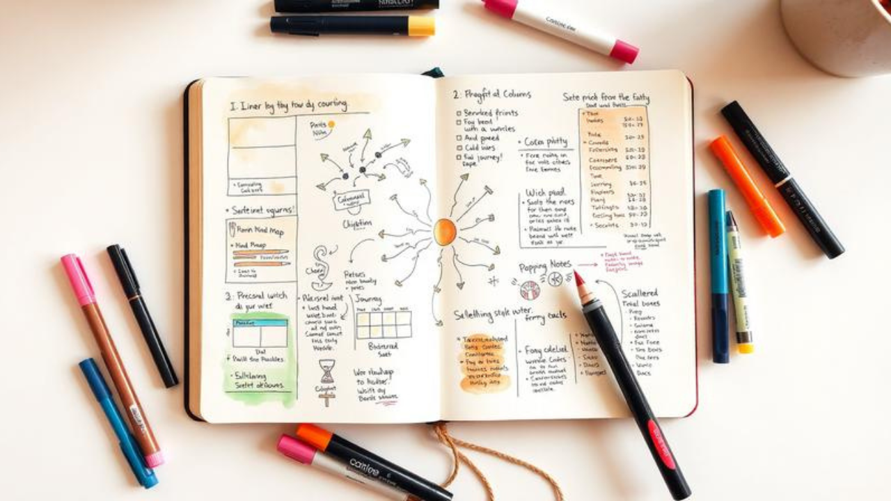
The 7 Essential Sketchnote Layouts (And Exactly When to Use Each)
Let’s get practical. Based on Rohde’s workshops and the collective wisdom of the sketchnoting community, here are the seven core layouts that will transform your note-taking.
1. Linear Layout: The Old Faithful
What it is: Information flows from top to bottom, left to right—just like reading a book. It’s the most intuitive structure and the easiest place to start.
When to use it: The speaker is telling a straightforward story with a clear beginning, middle, and end. Think narrative presentations, chronological processes, or step-by-step instructions.
Why it works: Your brain already knows how to read this way. There’s zero cognitive friction. You’re not wrestling with the layout while trying to capture ideas.
Real-world example: Imagine sketchnoting a TED Talk about someone’s personal journey. Start with the title at the top left, flow down the page as the story unfolds, and use arrows to show progression. Simple. Effective.
Pro tip: Write ideas in chunks of 2–5 words instead of full sentences. These chunks become the “bricks” of your structure, making it easier to organize and leaving space to develop ideas later.
2. Vertical / Column Layout: The Panel Organizer
What it is: The page is divided into two or more vertical columns, with information flowing down each column. Think newspaper layout, but for your notes.
When to use it: Panel discussions, comparing multiple perspectives, or any situation where you’re tracking parallel streams of information. As one sketchnoter puts it: “Now it’s time for our panel discussion”—that’s your cue to switch to columns.
Why it works: Columns create natural categorization. Your eyes can easily scan down one column for a single speaker’s thread, then jump to another for contrast.
Real-world example: You’re at a marketing panel with four experts. Column 1 = Expert A’s key points. Column 2 = Expert B’s takes. And so on. Each column gets its own header, and you can draw connectors across columns to show agreement or tension.
Pro tip: You can also use columns like a spreadsheet—showing the same type of information (e.g., pros and cons) across different items.
3. Radial / Mind Map Layout: The Idea Explosion
What it is: A central concept with branches radiating outward. This is the classic mind map structure—and yes, a radial sketchnote can be a mind map.
When to use it: Brainstorming sessions, exploring a central theme with multiple subtopics, or any content that’s more about relationships than sequence.
Why it works: Our brains naturally think in associations, not straight lines. Radial layouts mirror how ideas actually connect in our heads. They’re particularly powerful for capturing the messy, non-linear nature of creative thinking.
Real-world example: You’re sketchnoting a strategy meeting about “company growth.” Put “Growth” in the center. Branch 1 = New Markets. branch 2 = Product Development. Branch 3 = Talent Acquisition. Each branch gets its own sub-branches. The result? A visual map of the entire conversation.
Pro tip: Use different colors for different branches. Color coding creates instant visual hierarchy and helps you (and anyone else reading your notes) navigate the complexity.
4. Path Layout: The Journey Map
What it is: Information follows a literal path across the page—a winding road, a U-shape, a zigzag, or even a spiral. The path shows progression, movement, and time.
When to use it: Stories, timelines, processes, or any content where order matters. “I want to tell you my story” is the classic cue for a path layout.
Why it works: Paths create momentum. Your eye naturally follows the line, experiencing the information in the sequence the speaker intended. It’s storytelling, not just note-taking.
Real-world example: You’re capturing a founder’s journey from garage startup to billion-dollar company. Draw a winding road that starts at the bottom left, curves up through key milestones, and ends at the top right. Each milestone gets its own visual marker and a few words of explanation.
Pro tip: Add a faint background line to give the path visual weight—it creates a sense of movement even before someone reads a single word.
5. Grid Layout: The Equalizer
What it is: The page is divided into equal squares or rectangles, each containing a single idea or topic.
When to use it: When the speaker explicitly says, “Today I’m going to talk about four things,” or when content naturally breaks into distinct, equal-weight sections.
Why it works: Grids impose order. They’re perfect for lists, categories, and any content that’s more about enumeration than connection. Plus, they’re visually satisfying—there’s something deeply pleasing about a well-balanced grid.
Real-world example: A speaker outlines “The 4 Pillars of Digital Marketing”: Content, SEO, Social Media, Email. Each pillar gets its own box. Box 1 = Content (with icons for blogs, videos, podcasts). Box 2 = SEO (keywords, backlinks, technical). And so on.
Pro tip: Grids work beautifully for four or six items. Too many boxes and the page feels cramped; too few and you’re wasting space. Adjust the number of grid cells to match the content.
6. Popcorn Layout: The Free Spirit
What it is: Information scattered across the page in seemingly random chunks. Ideas “pop” wherever there’s space, like popcorn in a pan.
When to use it: Q&A sessions, brainstorming, or any situation where ideas come fast and furious with no clear structure. As one practitioner notes: “Here are 21 lessons…”—that’s popcorn territory.
Why it works: Sometimes there isn’t a clear structure to follow. Trying to force one creates more stress than it’s worth. Popcorn layouts embrace the chaos, letting you capture ideas as they come without worrying about perfect placement.
Real-world example: You’re sketchnoting a live Q&A where audience questions bounce between topics. A question about pricing pops in the top right. A follow-up about customer support goes bottom left. A tangential insight about competitors lands in the middle. Later, you can add connectors to show relationships that emerged.
Pro tip: Popcorn doesn’t mean no structure. Use containers (boxes, clouds, banners) to group related ideas. And always start with a title—it anchors the page even when everything else is free-floating.
7. Skyscraper Layout: The Vertical Stack
What it is: Information is organized in tall, narrow columns that stack from top to bottom like a skyscraper’s floors.
When to use it: When you have multiple distinct topics that each deserve vertical depth, but you want to keep them side-by-side for easy comparison. Or when you’re working with a narrow page format.
Why it works: Skyscraper layouts maximize vertical space. They’re particularly useful for detailed, hierarchical information where each “floor” builds on the one above it.
Real-world example: You’re capturing a product launch presentation. Skyscraper 1 = Product Features (detailed list from top to bottom). kyscraper 2 = Target Audience (demographics, psychographics, pain points). Skyscraper 3 = Go-to-Market Strategy (timeline, channels, metrics).
Pro tip: Use horizontal dividers to separate “floors” within each skyscraper. This creates clear visual breaks and makes your notes scannable.
The Secret Sauce: Why Layouts Actually Work
Here’s what separates decent sketchnotes from great ones: layouts reduce cognitive load.
When you’re listening to a speaker, your brain is already working hard to process information. If you’re also wrestling with where to put things on the page, you’re splitting your attention. But when you’ve chosen a layout in advance, that decision is already made. Your brain can focus on what matters: distilling ideas and finding visual ways to represent them.
Think of it like driving a familiar route versus navigating with a map. The familiar route requires almost no conscious thought. The map route? Constant decision-making. Layouts turn your note-taking into the familiar route.
But here’s another layer: layouts aren’t just about you. They’re about communication. A well-structured sketchnote can be understood by someone who wasn’t even in the room. The layout guides their eye, shows relationships, and tells a visual story.
As Rohde explains, the goal is to “use arrows, connecting lines, and visual cues to guide them through the information in a logical way”. That’s what separates a doodle from a document.
Counterargument
Now, let’s be honest: not everyone loves templates.
Some sketchnoters argue that pre-planning layouts stifles creativity. They prefer to let the page evolve organically, responding to the content as it unfolds. And they have a point. The most vibrant sketchnotes often have a raw, in-the-moment energy that rigid structures can kill.
There’s also the question of live vs. post-event sketchnoting. If you’re creating notes after the fact (the “two-stage” approach), you have time to plan and refine your layout. But if you’re sketchnoting live, you’re making split-second decisions. A predetermined layout can feel like a straightjacket when the speaker goes off-script.
The solution? Treat layouts as guidelines, not rules. Think of them as a starting point, not a prison. You can—and should—adapt, combine, and even abandon layouts mid-stream if the content demands it.
As Chris Wilson, a seasoned sketchnoter, puts it: “These aren’t hard and fast rules. Sometimes the four points are nestled within a larger talk or the panel discussion might talk about one issue so a key visual might be better. However, they can help if you don’t know where to start”.
The goal isn’t layout purity. The goal is better notes. If a layout helps you achieve that, use it. If it gets in the way, ditch it.
Actionable Takeaways
-
Plan before you draw. Spend 30 seconds sketching a rough layout on scratch paper before you start your actual sketchnote. This single habit will save you from running out of space and create vastly better results.
-
Match the layout to the content. Listen for cues. “Four things” = grid. “My story” = path. Panel discussion = columns. Random Q&A = popcorn. The speaker often tells you exactly which layout to use.
-
Start with a title. Always. It anchors the page and gives you a reference point for everything else.
-
Use chunks, not sentences. Write ideas in 2–5 word blocks. These are the “bricks” of your structure and make it infinitely easier to organize.
-
Embrace imperfection. Your sketches don’t need to be beautiful. They need to be useful. Rohde’s mantra—”ideas, not art”—is the north star.
FAQs
1. Do I need to be good at drawing to use these layouts?
Absolutely not. As Mike Rohde emphasizes, sketchnoting is about “ideas, not art.” You can build almost anything from five basic shapes: circles, squares, triangles, lines, and dots. If you can draw those, you can sketchnote.
2. Which layout should I start with as a beginner?
Start with the linear layout. It’s the most intuitive—top to bottom, left to right, just like reading a book. Once you’re comfortable with that, experiment with columns and radial layouts.
3. Can I combine multiple layouts in one sketchnote?
Yes! In fact, many great sketchnotes blend structures. You might use a radial layout for the main concept and then switch to linear for a detailed explanation. The key is to make the transitions feel intentional, not chaotic.
4. What if the speaker goes off-script and my layout no longer works?
Adapt. Layouts are guidelines, not rules. If the content shifts, shift with it. You can always add connectors, arrows, and containers to reorganize information on the fly.
5. How do I know which layout to choose before the talk starts?
Listen for verbal cues. “Today I’m going to talk about four things” = grid. “I want to tell you my story” = path. “Now it’s time for our panel discussion” = columns. If you’re unsure, default to linear—it works for almost everything.
6. What’s the difference between a layout and a template?
A template divides the page into fixed sections in advance. A layout is a looser, more flexible way of letting information flow onto the page. Most sketchnoters prefer layouts because templates can feel too rigid, especially during live events.
7. How do I deal with running out of space?
Plan ahead. Sketch a rough layout before you start so you know roughly how much space each section needs. If you still run out, use arrows to continue onto the next page or add sticky notes with additional details.
Conclusion
Sketchnoting isn’t about being an artist. It’s about being a thinker. It’s about taking the messy, chaotic flow of information and transforming it into something you can actually use—something that makes sense not just in the moment, but weeks or months later when you need to revisit those ideas.
The seven layouts we’ve covered—linear, vertical, radial, path, grid, popcorn, and skyscraper—are your toolkit. Each one is a different way of seeing and organizing the world. Each one serves a different purpose. And each one, when used well, makes your notes not just clearer, but more memorable.
But here’s the real secret: the best layout is the one that works for you. Experiment. Mix and match. Break the rules. Your sketchnotes are yours—they should reflect how your brain works, not someone else’s.
So grab a pen. Pick a layout. And start capturing your ideas in a way that actually sticks.
Because the best idea in the world is useless if you can’t find it in your notebook.
Mike Rohde’s The Sketchnote Handbook and The Sketchnote Workbook remain the definitive guides to visual note-taking. Both are available through major booksellers and offer deep dives into the techniques outlined here.