The Hidden Superpower in Your Visual Notes
You’re sitting in a conference, listening to a brilliant speaker. Your phone is full of notes—paragraphs of text you’ll never read again. Meanwhile, the person next to you is sketching something that looks like a work of art: a page bursting with hand-drawn letters, playful fonts, arrows, and containers that somehow capture the entire talk in a single glance.
That’s the power of sketchnoting. And the secret ingredient? It’s not the drawings. It’s the typography.
According to Mike Rohde, the pioneer of modern sketchnoting, sketchnotes are “rich visual notes created from a mix of handwriting, drawings, hand-drawn typography, shapes, and visual elements like arrows, boxes, and lines”. Notice that “hand-drawn typography” comes before drawings. That’s because your lettering choices determine whether your visual notes are forgettable or unforgettable.
Here’s the problem: most people treat their sketchnote handwriting like a boring afterthought. They scribble the same generic letters for everything—titles, quotes, main ideas, and random thoughts all blending into a gray mush of undifferentiated text. The result? Notes that are about as memorable as a grocery list.
But what if your letters could do more than just convey words? What if they could convey meaning—through weight, style, size, and personality?
This article will transform how you think about sketchnote typography. You’ll discover the lettering styles that make visual notes pop, learn practical techniques you can start using today, and understand why great typography isn’t just decoration—it’s the backbone of effective visual communication.
Why Sketchnote Typography Matters Right Now
Before we dive into the styles, let’s talk about why this matters.
We live in an attention economy. Every day, we’re bombarded with information—emails, meetings, podcasts, videos, articles. Our brains are overwhelmed. Research consistently shows that we forget most of what we hear within hours. Traditional note-taking—linear, text-heavy, monochrome—doesn’t help. It’s passive. It’s boring. And it doesn’t engage the visual part of our brain.
Sketchnoting is different. It’s an active, visual way of capturing ideas that enhances focus, motivation, and recall. When you combine words with images, you’re encoding information in multiple ways, making it stickier and more accessible.
But here’s what many people miss: typography is the bridge between words and images. Your lettering choices create visual hierarchy, emotional tone, and organizational structure. They tell the reader—including your future self—what’s important, what’s related, and what’s worth remembering.
As one educator put it, “The style of a letter reflects the idea or tone of the keyword. Colour, contrast, size, density, and style all help create a strong message”.
Mike Rohde himself understood this so deeply that he created an entire typeface family—Sketchnote—specifically for visual notes. The typeface was “born of necessity” when Rohde needed hand-drawn fonts to illustrate his book, “The Sketchnote Handbook”. It was designed to be practical and convey “the human character and quirks of his normal handwriting and hand-drawn lettering”.
The point? Typography isn’t an afterthought in sketchnoting. It’s foundational. And mastering it can transform your notes from confusing scribbles into compelling visual stories.
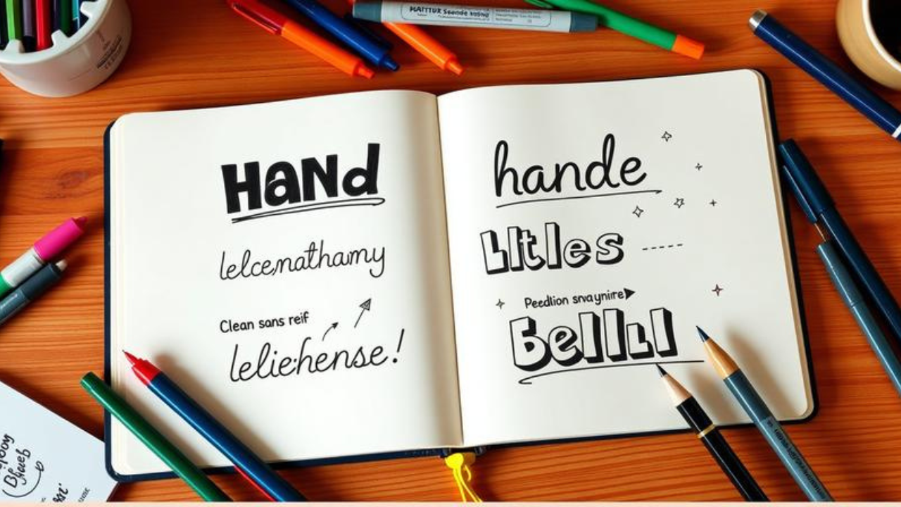
The Three-Font System: Your Typography Foundation
Let’s start with the basics. When you’re first learning sketchnote typography, resist the urge to go crazy with a dozen different styles. Instead, follow the “three-font system” recommended by experienced sketchnoters.
“I typically tell students to identify three types of fonts for their sketchnotes: Regular handwriting, which is for most of the sketchnote’s text; a big and bold font for titles; and a font for special direct quotes, which can also be put in a container to show importance”.
Here’s how this works in practice:
Font 1: Your Regular Handwriting – This is your workhorse. It should be clean, readable, and fast. Think of it as the body text in a magazine—easy to scan, not trying to impress. The key is consistency. If your regular handwriting is a mess, slow down. As one typography expert advises, “Slow down when you write. This might be counterintuitive because sketchnoting is all about speed, but at the same time, if you rush your handwriting, it will be hard to read and it will ruin the quality of your sketchnote“.
Font 2: Big and Bold for Titles – This is where you get to have fun. Your titles should command attention. Think block letters, all caps, thick strokes. This creates visual hierarchy, telling the reader “this is the main idea.”
Font 3: Special Font for Quotes or Key Points – This could be italic, script, or any style that stands out. The goal is differentiation. When something is important enough to quote directly or highlight, give it its own visual identity.
The beauty of this system is its simplicity. You don’t need to be a calligrapher. You just need three distinct styles that you can execute consistently.
Lettering Styles That Level Up Your Sketchnotes
Once you’ve mastered the three-font system, it’s time to expand your repertoire. Here are the most effective lettering styles for sketchnotes, ranging from beginner-friendly to more advanced.
Bold Block Letters
Block letters are the workhorse of sketchnote titles. They’re bold, readable, and command attention. “Bold Block Alphabets” are considered a structured, professional technique for “neat and impactful title headings”.
How to do it: Draw each letter as a rectangle with straight lines. Keep your strokes even. For extra impact, fill in the letters or add a shadow. The key is consistency—keep your letter heights and widths uniform. As one lettering guide suggests, “grid paper is your best buddy for keeping heights and widths even”.
Sans Serif Minimalism
If block letters feel too heavy, try modern sans serif styles. These are “blocky, minimalist letters and lines so straight they act like rulers in disguise”. Think of fonts like Helvetica or Futura—clean, modern, and confident.
Sans serif styles work beautifully for both titles and body text. They’re “clean, digital-inspired lines” that “basically scream ‘futuristic notebook pro'”. The absence of decorative flourishes (serifs) makes them highly legible, especially at small sizes.
Brush Script and Faux Calligraphy
Brush lettering has exploded in popularity, and for good reason. It adds personality, energy, and a human touch to your notes. “Brush lettering or ‘faux’ brush lettering has become super popular in the last few years”.
Brush script uses thick downstrokes and thin upstrokes to create elegant, flowing letters. Faux calligraphy achieves the same effect with a regular pen—you just add thickness to the downstrokes after writing the letters. It’s a fantastic way to add flair without needing special tools.
Playful Styles: Bubble Letters and Goofy Extras
Sketchnotes shouldn’t be stiff. They should be fun. That’s where playful styles come in. “Incorporate playful styles like Brush Script, Bubble Letters, and Goofy Extras to add personality and energy to your pages”.
Bubble letters are round, puffy, and approachable. They’re perfect for casual topics or when you want to convey a lighthearted tone. “Goofy Extras” might include letters with faces, doodle embellishments, or exaggerated features that make your notes feel alive.
Architect’s Handwriting
For a more professional vibe, consider “Architect’s Handwriting”—a neat, all-caps style with clean lines and deliberate spacing. It’s what happens when block letters meet precision. This style conveys competence and clarity, making it ideal for technical topics or professional settings.
3D and Shadow Effects
Want your titles to leap off the page? Add shadows. “Enhance your lettering with faux calligraphy, 3D shadows, and organic handwritten notes for added depth, texture, and unique character”.
A simple shadow effect involves drawing a duplicate of your letters slightly offset and filling it with a lighter color or leaving it empty. It takes seconds but adds a professional polish that makes your notes look like they belong in a published book.
The “Slow Down to Speed Up” Paradox
Here’s a counterintuitive truth about sketchnote typography: to take faster notes, you need to slow down.
“Sketchnoting is all about speed,” acknowledges one expert, “but at the same time, if you rush your handwriting, it will be hard to read and it will ruin the quality of your sketchnote. So fight the urge and just slow down”.
Think about it. A sketchnote that’s fast but illegible is useless. A sketchnote that’s slightly slower but beautifully structured is a treasure you’ll return to again and again.
The key is to slow down strategically. Write your titles and key points with care. Your regular handwriting can be faster, but even then, aim for readability over speed. With practice, your “slow” will become your “fast” as muscle memory takes over.
The Counterargument: Isn’t This Just Fancy Doodling?
Let’s address the elephant in the room. Some people dismiss sketchnote typography as mere decoration—a distraction from the real work of capturing information.
They have a point. If you spend so much time making your letters pretty that you miss the speaker’s next point, you’ve defeated the purpose. Sketchnoting is about capturing ideas, not creating art.
But here’s the nuance: effective typography isn’t about prettiness. It’s about communication. When you use different lettering styles, you’re creating visual structure. You’re telling the reader (including your future self) what matters. You’re making your notes easier to scan, remember, and act upon.
Consider this: a wall of identical handwriting is harder to process than a page with clear typographic hierarchy. The visual variety actually speeds up comprehension. So good typography isn’t a luxury—it’s a functional necessity.
The trick is balance. Practice your lettering styles until they become second nature. That way, you can execute them quickly without breaking your flow. As Mike Rohde demonstrates, you can create stunning visual notes in real-time during live events. It’s not about being an artist. It’s about being an intentional communicator.
Actionable Takeaways
1. Start with the three-font system. Pick three distinct styles—regular, bold title, and special quote—and stick with them until they feel automatic.
2. Slow down on your titles. Your most important ideas deserve the most attention. Take an extra second to make your titles bold and clear.
3. Practice with grid paper. Grid lines help you keep letters consistent in size and spacing. It’s the fastest way to improve your lettering.
4. Build a “visual vocabulary.” Start with five simple shapes—circle, square, triangle, line, dot—and build from there. Your lettering will improve as your drawing confidence grows.
5. Don’t strive for perfection. Sketchnotes are about capturing ideas, not creating art. Embrace the quirks of your handwriting. As Mike Rohde’s typeface shows, “irregular strokes” and a “slightly bouncy baseline” are features, not bugs.
Frequently Asked Questions
1. Do I need to be good at drawing to use sketchnote typography?
Absolutely not. Sketchnoting is about capturing ideas, not creating art. As one guide puts it, “this approach doesn’t require advanced drawing or hand-lettering skills; anyone can learn how to use simple lines, connectors, shapes, and text to take dynamic notes”. Your handwriting and basic lettering skills are enough to start.
2. How many lettering styles should I learn?
Start with three: regular handwriting, bold titles, and a special style for quotes. Once you’re comfortable with those, experiment with more. Most sketchnoters use 3-5 styles regularly.
3. What’s the best pen for sketchnote typography?
A fine-tip pen (0.3mm to 0.5mm) gives you control for detailed letters, while a thicker pen (0.7mm to 1.0mm) works well for bold titles. Many sketchnoters carry a set of pens in different thicknesses. For practice, a simple ballpoint or gel pen works fine.
4. Should I use uppercase or lowercase letters?
Both! Uppercase letters tend to be more legible and bold, making them great for titles. Lowercase is faster to write and works well for body text. Many sketchnoters use a mix: all-caps for titles, sentence case for regular text.
5. How do I practice sketchnote lettering?
Use grid paper to practice consistent sizing. Start by copying your favorite styles from other sketchnotes. Mike Rohde offers downloadable practice sheets and worksheets. Even 10 minutes of daily practice will show results.
6. What’s the difference between hand lettering and calligraphy?
Hand lettering is drawing letters (you construct each letter), while calligraphy is writing letters (you create them with a single stroke). For sketchnotes, hand lettering is more practical because you can do it with any pen, not just specialized calligraphy tools.
7. Can I use digital tools for sketchnote typography?
Yes! Many sketchnoters use iPads with apps like Procreate or GoodNotes. If you’re drawing digitally, “use a grid to keep your lines straight”—it helps tremendously. Digital tools also let you experiment with different styles without wasting paper.
Conclusion
Your sketchnotes are only as powerful as the typography that carries them. The words matter, of course. But how those words look matters just as much. Typography creates hierarchy, emotion, and structure. It turns a jumble of notes into a visual story that your brain can actually remember.
The beauty of sketchnote typography is that anyone can do it. You don’t need artistic talent or expensive tools. You just need intention. Choose three styles. Practice them. Slow down on what matters. And trust that your imperfect, human handwriting is exactly what makes your notes uniquely yours.
As Mike Rohde reminds us, “Don’t be afraid to be silly or funny, because I think those do well to capture the feeling of the idea”. Your lettering should reflect not just the words you’re capturing, but the feeling behind them.
So grab a pen. Open your notebook. And give your letters the personality they deserve. Because in the world of sketchnoting, typography isn’t just about looking good—it’s about thinking better.
What’s your go-to lettering style for visual notes? Start practicing today, and watch your sketchnotes transform from forgettable to unforgettable.